The Overlooked Detail That Makes Aesthetic Rooms Feel Complete
You’ve spent weeks choosing the perfect wall color. You’ve layered textures — linen, wool, maybe a touch of rattan. The lighting is warm and intentional. Every candle, every book spine, every plant placement tells a story. And then there it is: the door. With a plain, mass-produced number plate that looks like it came from the maintenance aisle of a hardware store.
It’s the interior equivalent of putting together a beautiful outfit and then grabbing a random bag that doesn’t match. Technically functional. Aesthetically? A missed note.
Door signage is one of those details that most people never think to style — which is exactly why it has so much power when you do. A thoughtfully chosen room sign is like the earrings of a space: small, personal, and surprisingly impactful in pulling the whole look together.
Why This Detail Matters More Than You’d Think
There’s a concept in interior styling called “visual continuity” — the idea that every element a person encounters in a space should feel like it belongs to the same world. When one piece breaks the pattern, the eye catches it immediately, even if the mind doesn’t consciously register why something feels off.
Door numbers and room signs are one of the most frequent pattern-breakers in otherwise beautifully styled spaces. They’re often the one element that was never chosen — just inherited from the builder or landlord and never questioned. But once you see the disconnect, you can’t unsee it.
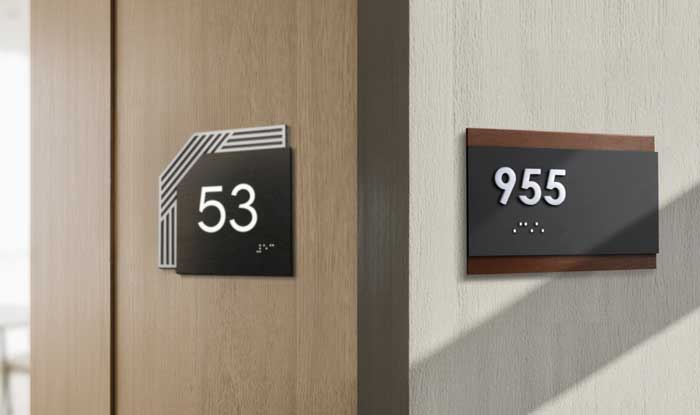
The good news? This is one of the easiest aesthetic upgrades you can make. Room number signs come in materials like natural wood, matte acrylic, and brushed stainless steel — and choosing one that matches your interior’s mood can make a hallway or doorway feel instantly more intentional.
Matching Your Door Sign to Your Aesthetic
This is the fun part. Different materials and finishes create completely different vibes, so your door sign can (and should) reflect the same aesthetic language as the rest of your space. For instance:
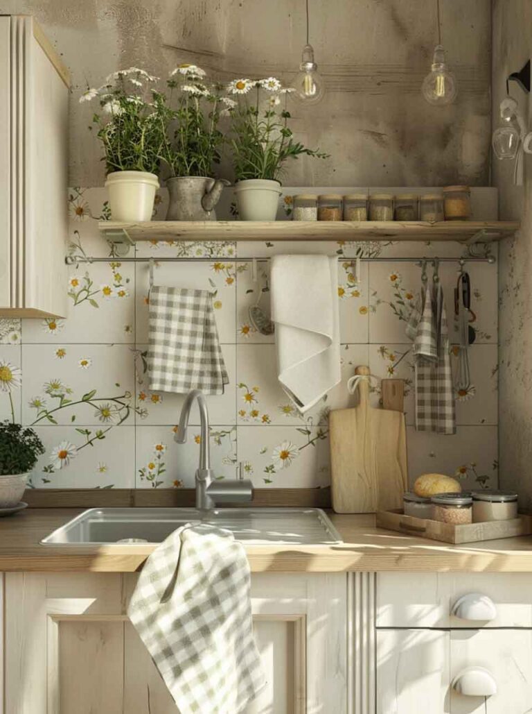
- Warm minimalism and Japandi. A light wood sign with clean, simple numbering. No ornament, no shine — just natural grain and quiet precision. Think oak or maple tones against a warm white wall. The sign disappears into the palette while adding a layer of tactile warmth.
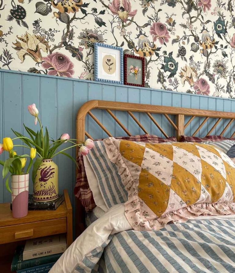
- Dark Academia and moody interiors. A dark walnut or espresso-toned wood sign with traditional serif numbering feels right at home alongside leather-bound books and heavy textiles. If your space has a library-meets-old-world energy, your door sign should echo that weight.
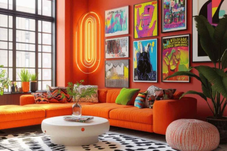
- Modern and monochrome. Matte black acrylic with white lettering — clean, editorial, and bold without being loud. This works beautifully in spaces built around contrast, black-and-white photography, and streamlined furniture.
- Coastal and organic. Light wood with a natural, unfinished feel. Something that could have washed up beautifully on a beach. Paired with linen curtains and rattan details, it extends the palette right to the door.
- Industrial and urban. Stainless steel or a wood-and-metal combination. Something with visible structure — maybe standoff mounts that create a slight shadow against the wall. It mirrors the exposed-element honesty that defines the aesthetic.
Beyond Your Front Door: Where Room Signs Elevate a Space
You don’t need a hotel or an office to benefit from intentional door signage. In any home with multiple rooms — especially if you host guests, run a home studio, or rent through Airbnb — small signs create a sense of curation that people notice and remember.
A few ideas that work beautifully in real homes:
A numbered guest room that makes visitors feel like they’ve checked into a boutique hotel. A labeled home office that creates a psychological boundary between work and living space. A playroom or creative studio with a sign that gives it identity and importance. Even a bathroom — a small, well-chosen sign on the door adds a layer of polish that most homes never achieve.
For anyone who styles spaces for short-term rental, this is especially worth considering. Guests notice and photograph the small details. A custom door sign in a material that matches the interior’s mood is the kind of touch that shows up in five-star reviews and Instagram stories.
The Styling Principle Behind It All
There’s a reason aesthetic-focused people obsess over drawer pulls, light switch covers, and soap dispensers. It’s not about the object itself — it’s about the feeling of completeness when every element in a room speaks the same language. Door signs belong in that same category of “small things that complete the picture”.
The most beautiful interiors aren’t the ones with the most expensive furniture. They’re the ones where someone paid attention to the transitions — the moments between rooms, the edges where one space meets another. A door is exactly that kind of transition. And the sign on it is your last chance to say something intentional before someone steps through.
It’s a tiny detail. But in a space built on mood, tiny details are everything.
– This post is part of a paid collaboration.